HTML tables are a relic of the past. After all, it’s a nightmare to try to squeeze a table full of information onto a tiny mobile screen while still preserving the elegant beauty of your website or web app. Today, divs are the way to go.
Still, I felt pretty cool when I had to regularly use HTML tables at my first developer internship and remembered all the tags from my cringe-worthy childhood websites. And I didn’t shy away from tables when I built my gradebook application, Participation:
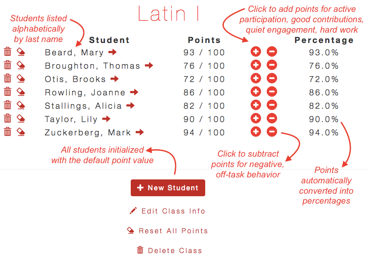
As a teacher, I’d dealt with several online gradebooks before that had definitely used HTML tables. It seemed the only way to go, gradebook-wise: student names and information went into neat and orderly columns, and you would never enter grades on your phone.
Shortly after releasing Participation, however, I was tasked at my developer job to make some HTML tables “not look like garbage.” I quickly learned that making HTML tables responsive (as I interpreted the task) did not mean using Bootstrap’s premade responsive table. It actually meant throwing away the HTML tables and putting the content of each table row into a “card” (basically a div with float: left).
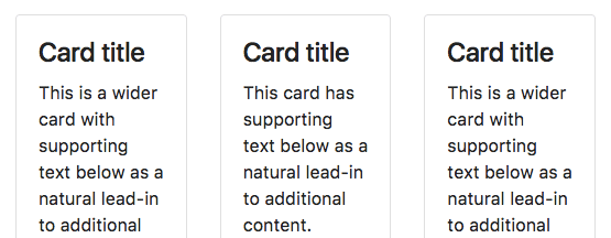
Cards from Bootstrap (image via hackerthemes.com)
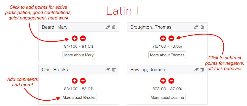
After work, I became intrigued by the idea of applying the same transformation (HTML tables to cards) to Participation. My HTML table wasn’t ideal for mobile devices: I had made it respond to a smaller screen by taking away some columns from the grade book, so that only the student’s name and the buttons to add/subtract points were left. But if I used cards, I could display all the information (like the student’s points and percentage) on a mobile screen.
However, I knew from a 2-hr UX course on Lynda that good UX design should be standard and familiar to my users. Wasn’t an HTML table standard for online gradebooks? Would teachers be confused by the card layout?
The tipping point for me was when I remembered that Class Dojo — the classroom management app I’d used for a hot second before deciding it was too young for my 9th-12th graders — used a card layout:
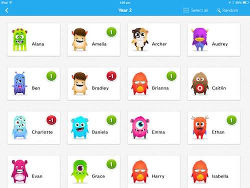
I didn’t think my sophisticated high schoolers would respond well to being depicted as small monsters (picture via eliselaidlaw.weebly.com)
Granted, I primarily knew of Class Dojo as a tablet/mobile app, but that was increasingly the way that the world was going. I decided to take the plunge and convert my gradebook table into a card layout. It wasn’t super easy, because I made the mistake of updating all my Rails gems and accidentally installed Bootstrap 4, so my entire app looked horrible for about an hour while I fixed it.
In the end, my HTML table was transformed into something much more sleek and responsive:
To improve your HTML tables, get rid of them and replace them with a card layout!